Welcome back, home decor lovers! If you are anything like me, you probably spend way too much time scrolling through Pinterest or saving Instagram reels of stunning room makeovers. There is just something incredibly satisfying about watching a dull, lifeless room transform into a vibrant, cozy sanctuary. And do you know what the secret ingredient usually is? You guessed it: color.
Whether you have just bought your first home or you are trying to make a cramped rental apartment feel like yours, choosing the right colors can feel completely overwhelming. Staring at a wall of hundreds of tiny paint swatches at the hardware store is enough to make anyone want to give up and just paint everything stark white. But hold that paintbrush!
Today, we are diving deep into the absolute best color trends you don’t want to miss this year. But we aren’t just talking about high-end, untouchable designer spaces. We are breaking down how to use these trendy hues in real life, on a real budget, and in real spaces, yes, even that tiny windowless bathroom you don’t know what to do with. Grab your favorite cup of coffee, and let’s get into it!
Why Color Trends Actually Matter (And How to Use Them)
Before we jump into the exact colors, let’s talk about the word “trend.” A lot of people hear “trend” and immediately think “fad.” They worry that if they paint their living room a trendy color today, they will hate it in three years.
But in the interior design world, color trends usually reflect broader shifts in how we live and what we crave emotionally. Right now, after years of sterile, cool grays and stark, hospital whites dominating our homes, the pendulum has swung. We are collectively craving warmth, comfort, nature, and personality. The trends right now are incredibly livable, deeply comforting, and highly adaptable.
The trick is not to blindly copy a magazine page. The trick is to take a trending color and apply it in a way that makes you happy. Let’s look at the standout hues making waves right now and how you can bring them home.
The Top Color Trends You Don’t Want to Miss
1. Earthy Terracottas and Baked Clays
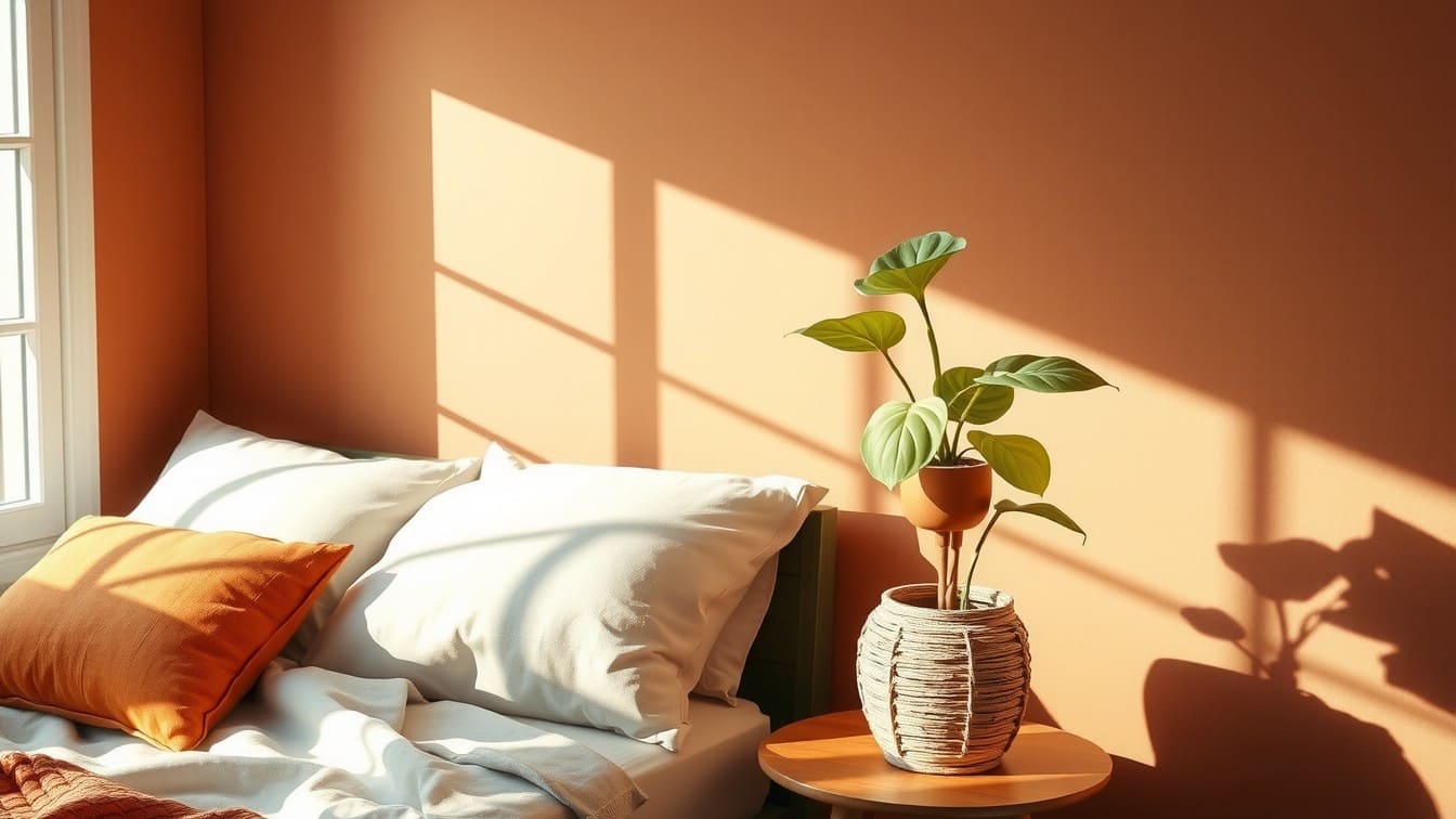
Say hello to the ultimate cozy color. Terracotta, baked clay, and muted rust tones are having a massive moment. These colors instantly warm a space, evoking sun-baked Mediterranean villas or a quiet desert sunset. They strike the perfect balance between being a “color” and acting like a neutral.
- Why it works: Terracotta has a grounded, earthy quality that instantly makes a room feel more intimate and inviting. It pairs beautifully with natural textures that you might already have in your home.
- Styling Tip: Pair baked clay walls with woven rattan furniture, warm leather accents, and lots of leafy green indoor plants. The green of the plants pops beautifully against the burnt orange undertones.
- Real-Life Use Case: Do you have a cold, north-facing bedroom that never gets good sunlight? Paint the walls terracotta. It acts like a visual hug, warming the chilly natural light.
- Budget-Friendly Idea: You don’t have to paint a whole room! Buy a few terracotta-colored linen throw pillow covers (you can find these for under $15 online) and a cheap terracotta pot from the garden center. Pop a plant in it, throw the pillows on your sofa, and you’ve instantly warmed up your living room.
2. Moody Jewel Tones (Emerald, Sapphire, and Deep Plum)
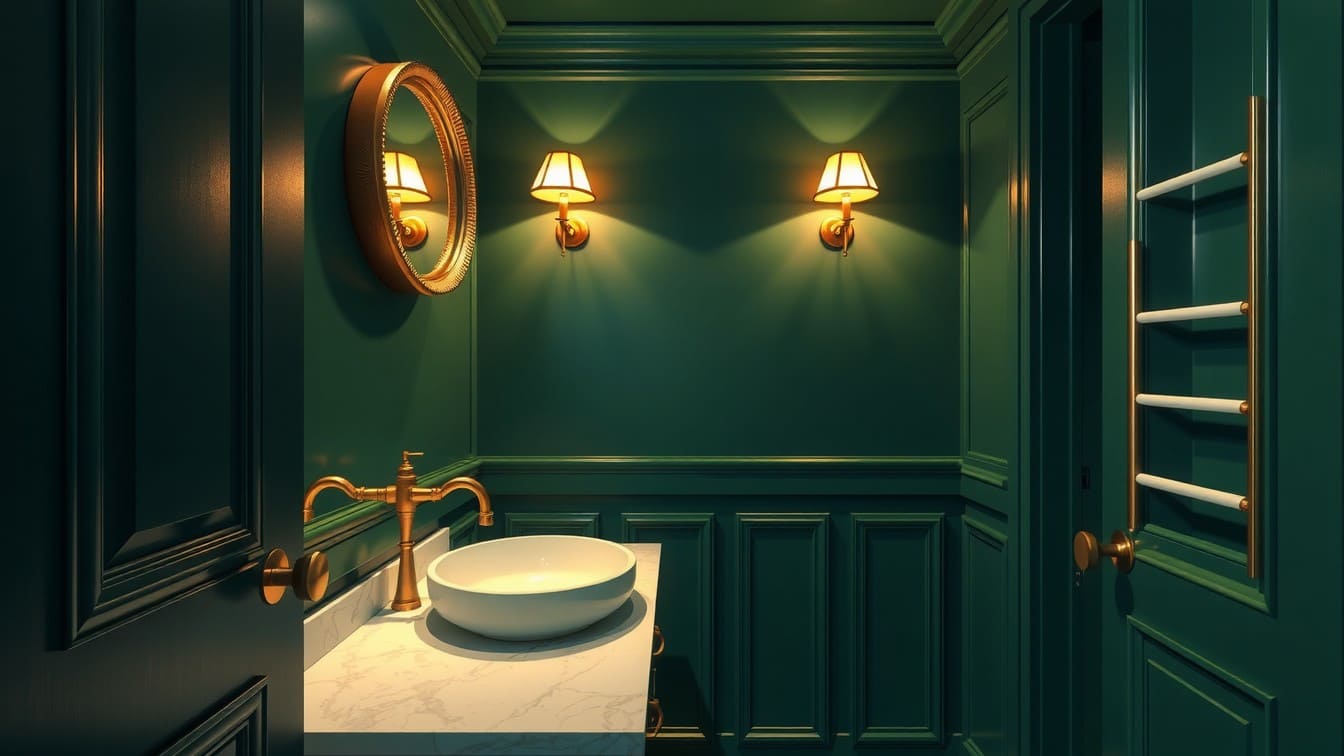
If you love a space that feels dramatic, sophisticated, and a little bit mysterious, this trend is for you. We are seeing a huge surge in deep, saturated jewel tones like emerald green, rich navy blue, sapphire, and even deep plum.
- Why it works: Dark colors are often misunderstood. People think they make rooms look smaller, but that’s actually a myth! Dark colors blur the edges of a room, making the walls recede. This creates an illusion of endless depth, making a space feel cozy, layered, and incredibly chic.
- Styling Tip: Contrast is your best friend here. Pair dark jewel-toned walls with warm metallic accents, such as brushed brass or antique gold picture frames, mirrors, and drawer pulls.
- Real-Life Use Case: Small rooms are perfect for dark colors. Think about a tiny powder room, a narrow entryway, or a small home office. Instead of fighting the lack of space with white paint (which just looks shadowy in small, dim rooms), lean into the moodiness.
- Budget-Friendly Idea: Paint an old piece of furniture! Find a beat-up wooden dresser on Facebook Marketplace or at a thrift store. Sand it lightly, prime it, and paint it a stunning emerald green. Add some cheap gold hardware from Amazon, and you have a custom, trendy statement piece for under $50.
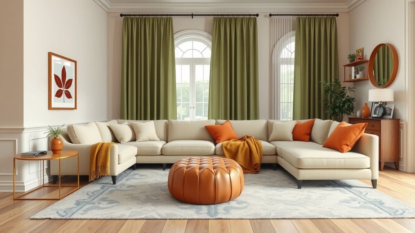
3. Soft, Serene Sage Greens
If there is one color that has officially crossed over from “trend” to “timeless classic,” it is sage green. This soft, dusty, gray-green is everywhere, and for good reason. It brings the calming essence of nature indoors without being overpowering.
- Why it works: Sage green is incredibly versatile. It is soothing to the eye, making it the perfect color for spaces where you want to unwind and relax. Because it has gray undertones, it acts like a neutral, meaning it goes with almost everything.
- Styling Tip: Sage green looks absolutely incredible with light woods (like white oak or birch) and crisp white trim. It creates a fresh, organic, Scandinavian-inspired look.
- Real-Life Use Case: Kitchens! If you are tired of an all-white kitchen but terrified of going too bold, sage green is your answer. It looks beautiful on kitchen cabinets, especially lower cabinets paired with white uppers. It is also a fantastic choice for a nursery or a master bedroom.
- Budget-Friendly Idea: If you rent and can’t paint your walls or cabinets, bring sage green in through textiles. Hang sage green velvet curtains, drape a chunky knit green blanket over your reading chair, or invest in a budget-friendly sage green washable rug.
4. Warm, Buttery Neutrals (Goodbye, Cool Gray!)
For the last decade, “millennial gray” was the default neutral. Gray walls, gray floors, gray sofas. But the design world has officially thawed out. We are shifting back to warm neutrals: creamy off-whites, warm beiges, mushroom, taupe, and oatmeal.
- Why it works: Warm neutrals provide a clean slate without feeling sterile or icy. They reflect light beautifully, make spaces feel elegant, soft, and lived-in.
- Styling Tip: The secret to making a neutral room look expensive and professionally designed is texture. If all your colors are similar, your materials need to be different. Mix linen curtains with a boucle chair, a chunky wool rug, and sleek ceramic lamps.
- Real-Life Use Case: Open-concept homes and large living areas. If you have a floor plan where the kitchen, dining, and living rooms all flow together, painting the entire main living area a warm, creamy beige (like Benjamin Moore’s Swiss Coffee) will make the whole house feel cohesive, bright, and airy.
- Budget-Friendly Idea: Swap out your cool-toned bright white lightbulbs for “soft white” or “warm white” bulbs (look for 2700K or 3000K on the box). This $10 fix will instantly stop your current walls from looking stark and cast a warm, buttery glow over your entire home.
5. Deep Chocolate Brown
Yes, you read that right. Brown is back, and it is chicer than ever. We aren’t talking about the flat, muddy browns of the early 2000s. We are talking about rich, velvety chocolate browns, espresso, and dark mocha.
- Why it works: Chocolate brown offers the depth and contrast of black, but with infinitely more warmth. It feels deeply luxurious and grounding.
- Styling Tip: Chocolate brown pairs well with lighter, contrasting shades. Try it with soft cream, muted blush pink, or even a pale dusty blue for a highly sophisticated palette.
- Real-Life Use Case: Use it as an accent! A chocolate-brown feature wall behind a bed, or a dark-brown velvet headboard, adds instant luxury to a primary bedroom.
- Budget-Friendly Idea: Keep an eye out for vintage wooden furniture. Instead of painting over that beautiful walnut or mahogany wood tone with chalk paint, embrace the dark, rich brown grain. Clean it up with some wood oil and let the natural deep brown be your trendy accent.
Practical Color Strategies for Every Space
Knowing the trendy colors is only half the battle. Knowing how to apply them is what takes your home to the next level. Here are some of the best design strategies to use right now.
The “Color Drenching” Technique
This is a massive trend right now, especially for small rooms or awkward spaces. Color drenching means painting the walls, baseboards, window trim, doors, and sometimes even the ceiling in the exact same color.
- Why it works: When you paint the trim a contrasting white, your eye stops at every line, making the room feel chopped up and smaller. When you color drench, the lines disappear. The room feels taller, wider, and much more cohesive. This is absolutely magical in small apartments or rooms with low ceilings.
The 60-30-10 Rule
If you are terrified of mixing colors, memorize this classic designer rule. When creating a color palette for a room, divide your colors into percentages:
- 60% Main Color: This is usually your walls, your large pieces of furniture (like a sofa), or a large rug. (e.g., Creamy warm white).
- 30% Secondary Color: This is your accent wall, your curtains, smaller furniture (like accent chairs), or painted cabinets. (e.g., Sage green).
- 10% Accent Color: This is the fun part! Throw pillows, artwork, lamps, vases, or small decor items. (e.g., Terracotta). This formula guarantees your room will look balanced and intentionally designed.
Consider the Light (The Secret Decorator’s Trick)
Never, ever choose a paint color based on how it looks in the store under fluorescent lights.
- North-facing rooms get cool, bluish light. They can make grays look icy and depressing. You need warm colors (terracotta, warm beige) to counteract the chill.
- South-facing rooms get bright, warm, golden light. Almost any color looks good here, but cool colors (like blue or sage green) will beautifully balance the sun’s intense heat.
- Always buy a small sample pot, paint a piece of cardboard, and tape it to your wall. Look at it in the morning, at noon, and at night before you commit!
Cheap and Easy Ways to Update Your Color Palette
You do not need thousands of dollars to bring these trends into your home. If you are decorating on a tight budget, here are a few of my favorite low-cost hacks:
- Removable Peel-and-Stick Wallpaper: Renters, rejoice! If you can’t paint, peel-and-stick wallpaper is a lifesaver. You can buy beautiful, trendy, jewel-toned, or botanical sage green wallpapers on Amazon. Use it to line the back of a boring bookshelf, cover an ugly kitchen backsplash, or create a faux accent wall.
- Dye Your Linens: Do you have boring white or gray curtains, duvet covers, or cloth napkins that have seen better days? Buy a $5 bottle of fabric dye (like RIT dye) in terracotta or chocolate brown. You can completely transform your textiles in your washing machine in an hour.
- Update Your Artwork: You don’t need to buy expensive new art. Go to a thrift store and buy cheap framed art. Keep the frames, but spray paint them a trendy color (like antique gold or matte black). Then, go online and purchase cheap digital downloads of trendy, earthy abstract art. Print them at your local pharmacy for a few dollars, and pop them into the painted frames.
- The Power of Throw Pillows: I say this all the time, but throw pillows are the easiest way to change the season or the trend in your home. Don’t buy full pillows; just buy the covers! They fold up tiny for storage, and you can swap them out whenever you want a new color scheme.
Conclusion
Bringing trendy colors into your home doesn’t have to mean completely starting over, spending a fortune, or committing to a style you will regret in five years. The current trends, warm earth tones, serene greens, deep rich jewel tones, and buttery neutrals, are all about creating a home that feels like a sanctuary.
Whether you decide to go all-in and color-drench your bedroom in deep plum, or you just want to dip your toes in the water by adding a terracotta throw blanket to your beige sofa, the most important rule of home decor is this: Do what makes you happy. Your home is your personal retreat, and the colors inside it should make you smile every time you walk through the front door.
Don’t be afraid to experiment, pick up a paintbrush, and have a little fun. You’ve got this!
FAQs
1. How do I choose the right color trend for my specific home?
Start by looking in your closet! We naturally gravitate toward wearing colors that make us feel good. If your wardrobe is full of deep blues and greens, you will likely feel comfortable living in those colors. Also, consider the permanent fixtures in your home you can’t change (like flooring or kitchen counters). Make sure the trend you pick harmonizes with the undertones of those permanent items.
2. Can I mix different color trends together, or will it look messy?
You can absolutely mix them! In fact, mixing trends often creates the most beautiful, custom-looking spaces. The key is to use the 60-30-10 rule mentioned earlier. For example, you could have warm, buttery neutral walls (60%), a sage green sofa or curtains (30%), and terracotta throw pillows and artwork (10%). They all work together beautifully because they share natural, earthy undertones.
3. I have dark floors and dark brown furniture. How do I use these colors without the room feeling like a cave?
If you have dark, heavy foundational pieces, lean into the “Warm, Buttery Neutrals” trend for your walls and large area rugs. This will provide the necessary contrast and lift the visual weight of the room. From there, you can safely bring in the darker, moodier trends (like emerald green or deep plum) through smaller accents, like table lamps, artwork, or a patterned accent chair, without making the room feel overwhelmingly dark.

Luxe is a home decor writer at DecorForBees, focusing on budget-friendly interior styling and modern living room design.